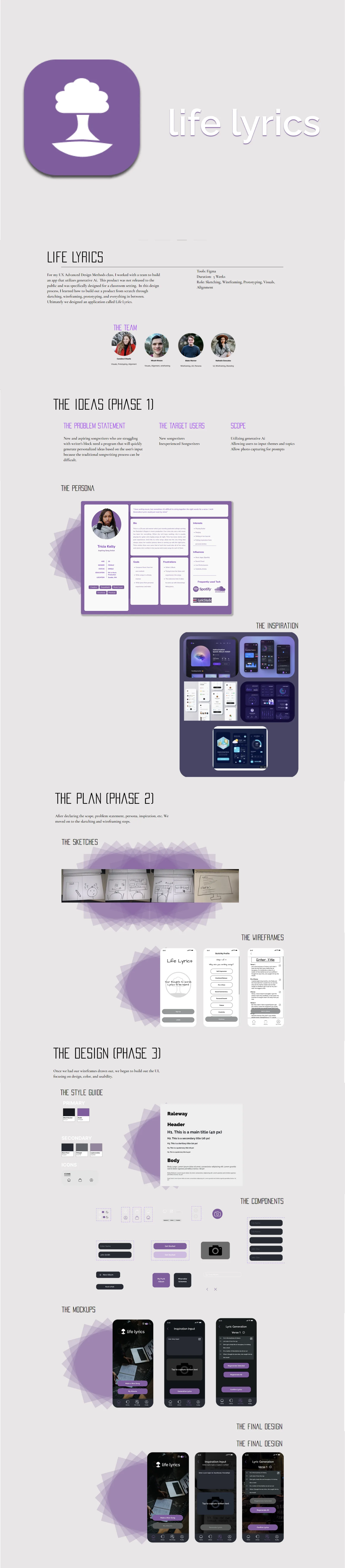
Life Lyrics App Design
Academic Project · 2023 · UX Designer
Overview
Life Lyrics is a concept mobile app designed to help users connect music to meaningful moments in their life. The idea: every song you add gets tagged to a memory, mood, or milestone — building a living, musical autobiography over time.
This was an academic team project across three design phases — from concept through high-fidelity prototype. My focus was the visual design system and the core interaction model for the home and playback screens.
The Problem
Design Process
Problem Pathway & First Concepts
We started by mapping the problem space — where do music apps fall short emotionally? The key gap: music is deeply personal but apps treat it as pure utility. We explored three initial directions: memory tagging, mood journaling, and milestone playlists. The team converged on a hybrid approach — tag songs to moments, build a timeline, surface them contextually.
Sketches & Wireframes
I sketched the core screens — home feed, player, and memory tagging flow — exploring how to surface emotional context without making the app feel heavy or journaling-like. The goal was to make memory association feel effortless, like a natural extension of listening rather than a separate task.
Wireframes in Figma established the information architecture: a home feed showing recent memories and "replay this day" suggestions, a player with tag-in-the-moment capability, and a timeline view that surfaces your musical history.
Visual Design System
I built the full visual system for the app. The brand language is bold and warm — dark backgrounds with vibrant purple accents to create the immersive feel of music without mimicking existing apps. Typography is Roboto throughout, keeping things readable and modern.
- Color palette: Deep charcoal backgrounds, primary purple (#7B2FBE), white text, warm amber for memory highlights
- Typography: Roboto — Regular for body, Medium for labels, Bold for display
- Components: Card system for memories, pill navigation, floating player bar, tag chip system
Final Mockups
The home screen shows your recent memory-tagged songs in a card feed with contextual prompts ("You listened to this the day you got promoted"). The player screen integrates the tagging action inline — one tap to associate a memory while the song plays, no interruption to the listening experience.
Outcome
The project produced a complete clickable prototype in Figma covering the core user journey from onboarding through daily use. The design system we built is reusable — every component is built as an auto-layout Figma component with light and dark mode variants.
What I Learned
- Emotional design requires restraint — the temptation to over-engineer the "memory" metaphor had to be balanced against keeping the core action (listening) effortless.
- Building a design system from scratch on a team project forced me to think about naming conventions and component structure in a way that individual projects don't.
- Dark-mode-first design is genuinely different — contrast ratios, color vibrance, and hierarchy all behave differently and need to be designed for, not retrofitted.